Web App
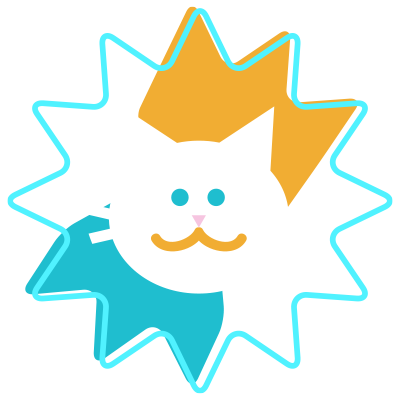
GatoClima
Project
My role
Product design
Brand design
UX design
UI design
Web Development
My strengths
- Ability to research
- Task management
- Empathy
- Creativity
- Analysis of information
- Self-motivation
- Graphic design
I made this project as part of CIFO’s design of interactive display course, carrying out all tasks assigned individually and tutored by the teachers team.
Context
As part of the “design of interactive displays” course I chose to create a web app for weather forecast. The weather seems to be unpredictable due sudden changes and it’s a conversational topic that continues being popular any time any place by all kinds of users, for example:
– The Erudite: Looks for precision and accuracy in forecast.
– The obsessive: Looks at the forecast several times per day.
– The Cautious: adapts his plan according to the forecast.
– The Disregard: simply does not worry about the topic and let get surprised by weather.
For GatoClima project I applied “Design thinking” process and focused on following question:
How could we create a cheerful weather app?
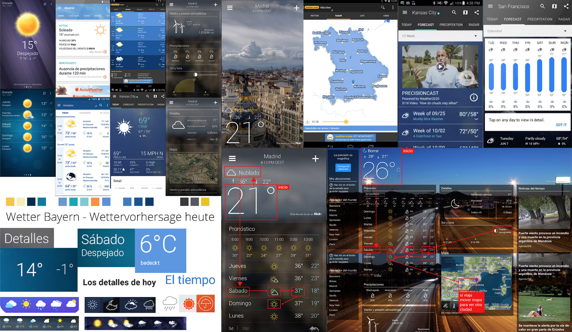
Benchmarking
With the product in mind I focused on research mobile and web apps of Spanish-speaking market. I analyzed their colors, typefaces, icons, multimedia resources, text content, navigation and usability.
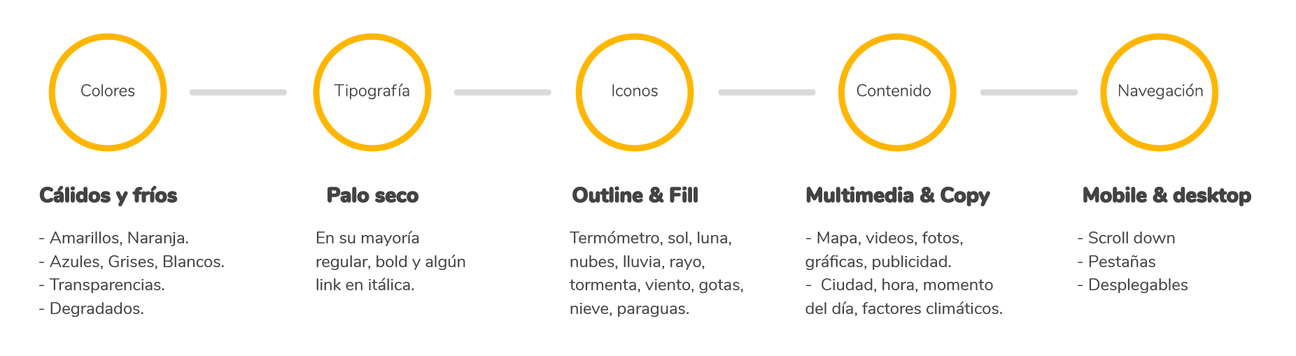
In the weather forecast market analysis I observed that own device’s mobile applications provide basic, concrete and quick-view information while in downloaded applications there were a lack of fast information and excessive advertising that confuse the user. Also most have a sober design style.
UX Methodologies
Survey #1
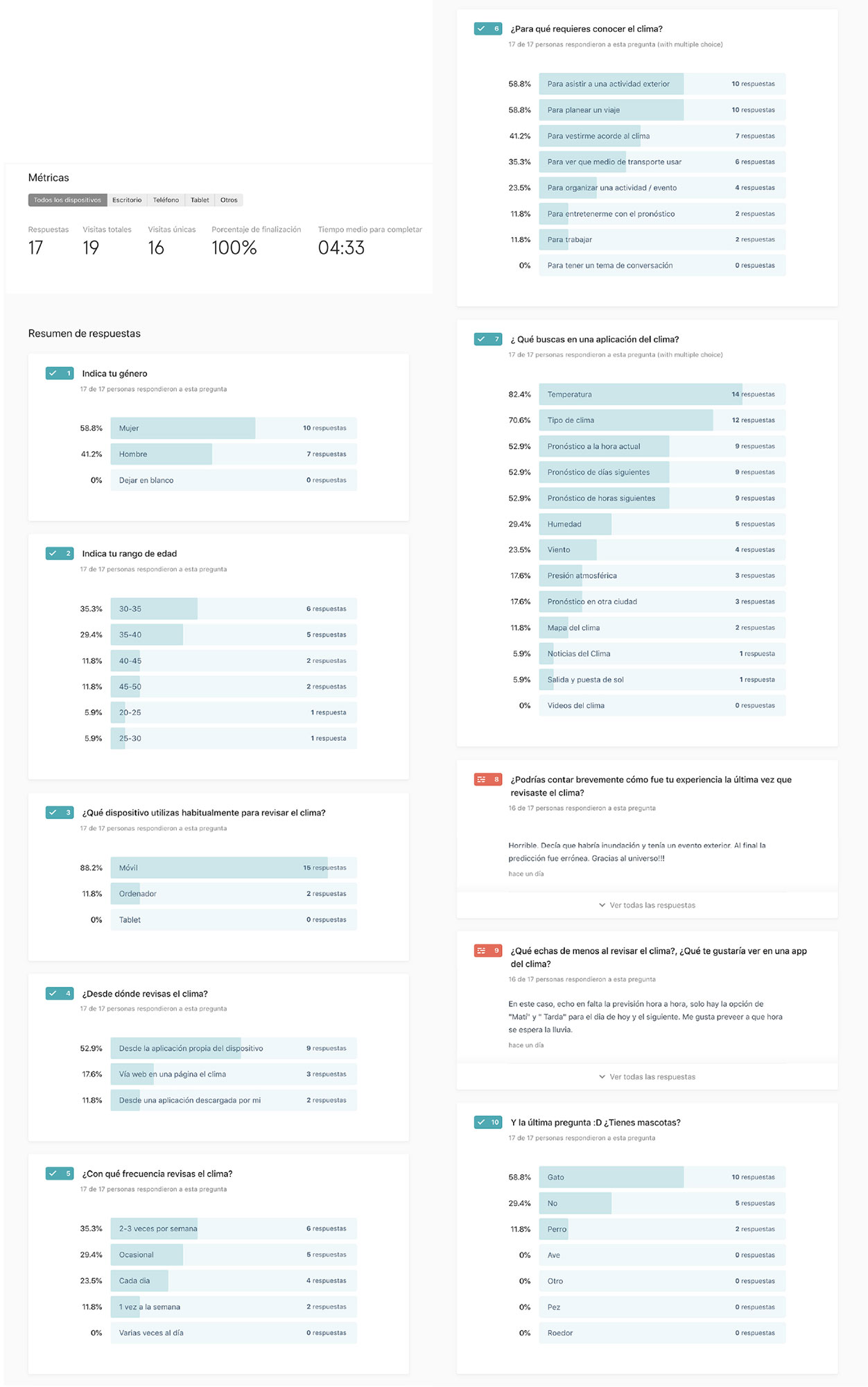
As a starting point to define the product I conducted a brief survey with the objective of evaluate my hypotheses and ideas, to obtain feedback from potential users and nail down the value proposition.
I formulated a battery of questions evaluating following points:
– The main reason(s) of use.
– Frequency of use.
– The most used features.
– The user experience.
– And finally to know if the user had pets.
I sent the survey to targeted users to be responded within 24 hours.
The survey helped me to know the use of such applications: frequency, experience and reasons to use it, device types and the number of users with pets. To highlight, I got that 88.2% of users connected by mobile, 52.9% from own weather app device, 35.3% used it prompt or occasional and 58.8% had cats. Great!
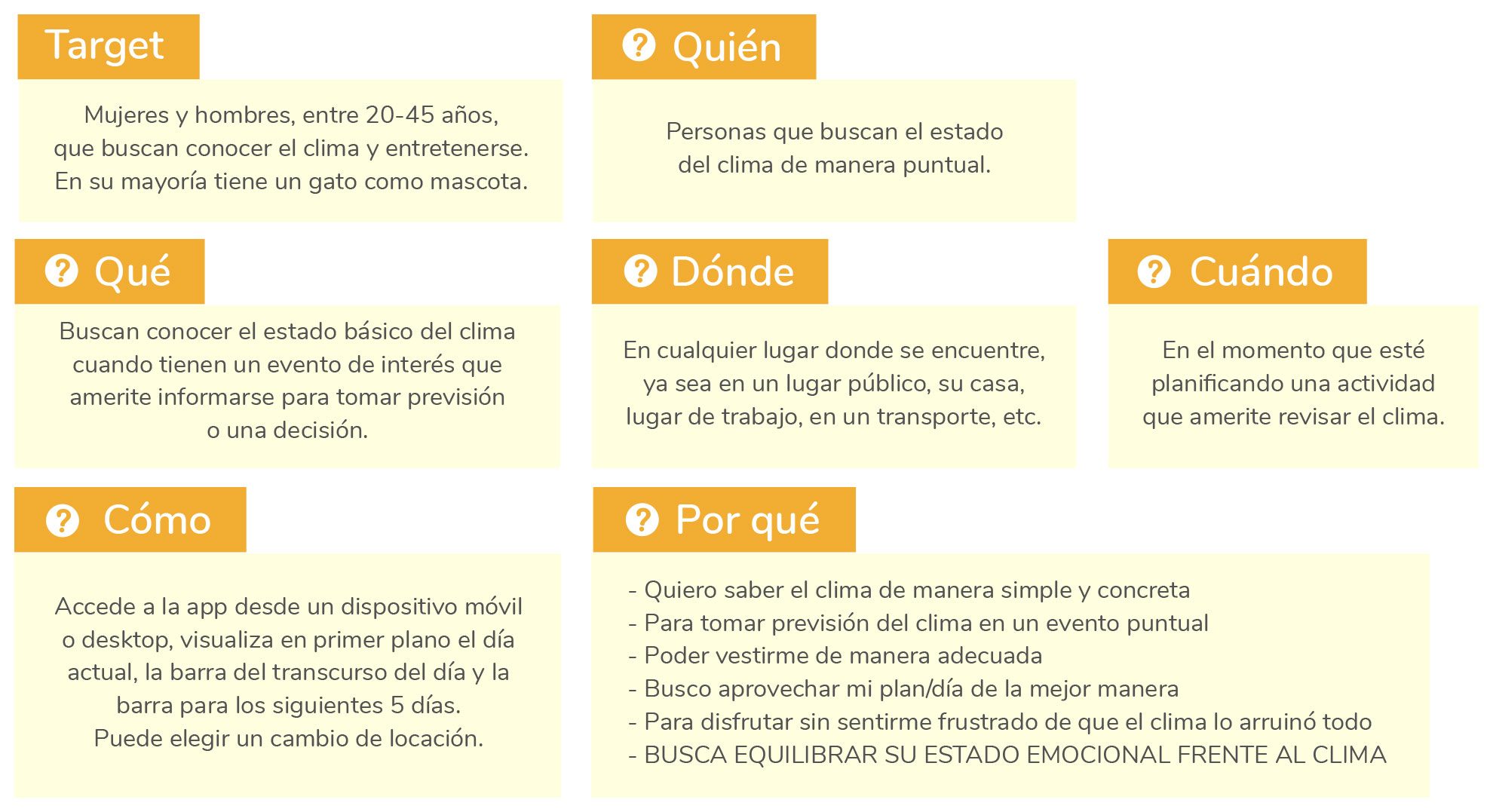
W’s questions
Based on survey#1 results I defined more precisely the product characteristics. By answering the W’s questions I placed the user into a context, analyse user’s product needs and to direct the design strategy.
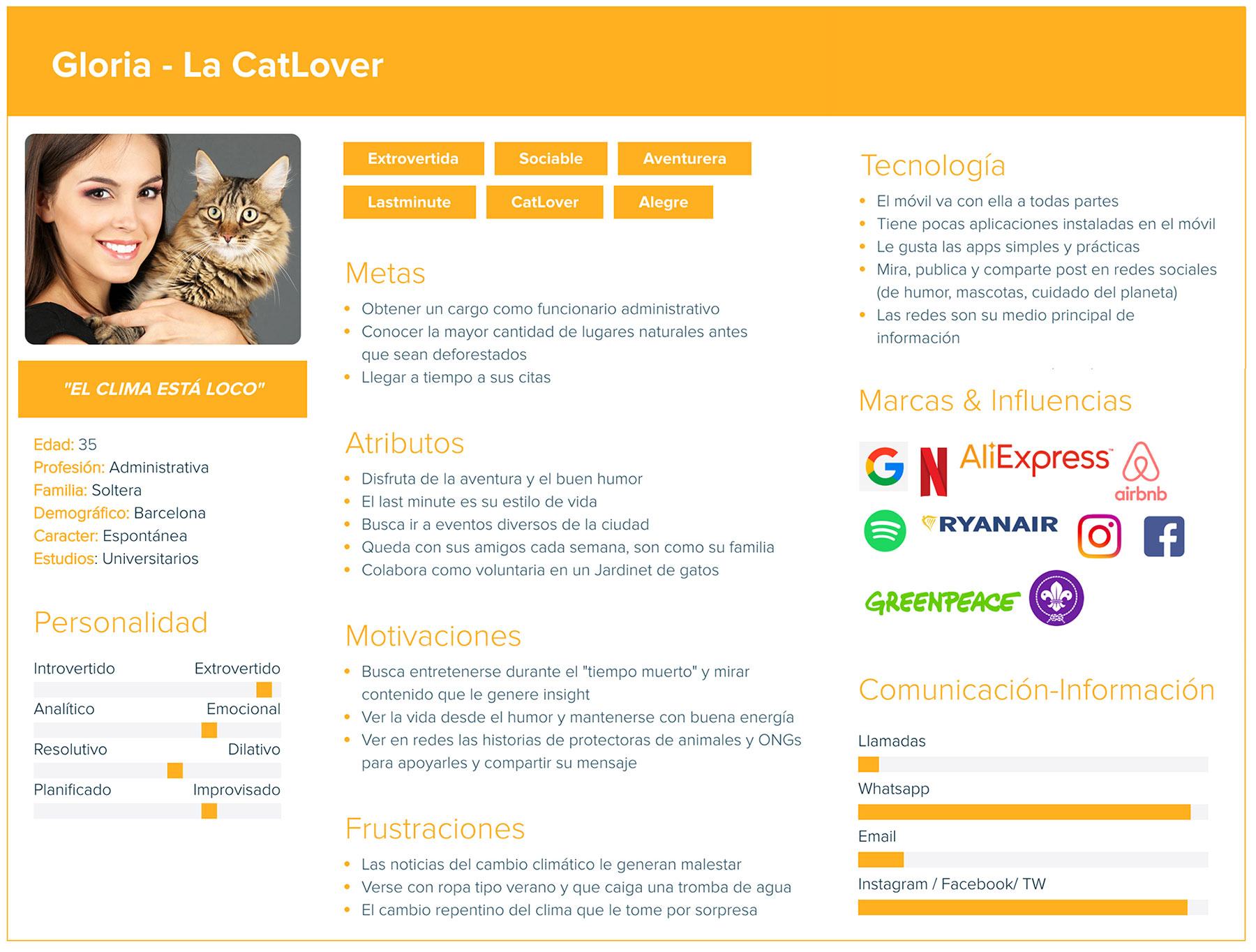
Design Persona
Survey# 1 was key to define the user archetype that represents GatoClima. The method of generative-qualitative study that I applied to define the user archetype was Design Persona.
Customer Journey
When the time to put myself into the user’s shoes through a Customer Journey map arrived, I took as example the analysis of Accuweather website.
– I accessed from a mobile device to evaluate touch points and difficulties that the user could find and also look for opportunities to improve the product.
– I set out a scenario and some tasks that the User PERSONA must complete and that would be continuously evaluated throughout the project.
“Imagine that today is Friday, you have finished your workday and are at the subway. You receive a friend’s message inviting you to go tomorrow Saturday at 10:00 p.m. to an open-air concert in Barcelona. You search on internet the weather forecast to decide if you want to go and what clothes to wear.”
The result of Customer Journey maps shows a dissatisfied user after investing a lot of time on searching, overwhelmed by advertising, frustrated by not seeing the forecast results clearly and ending the experience getting what he/she was looking for but feeling annoyed.
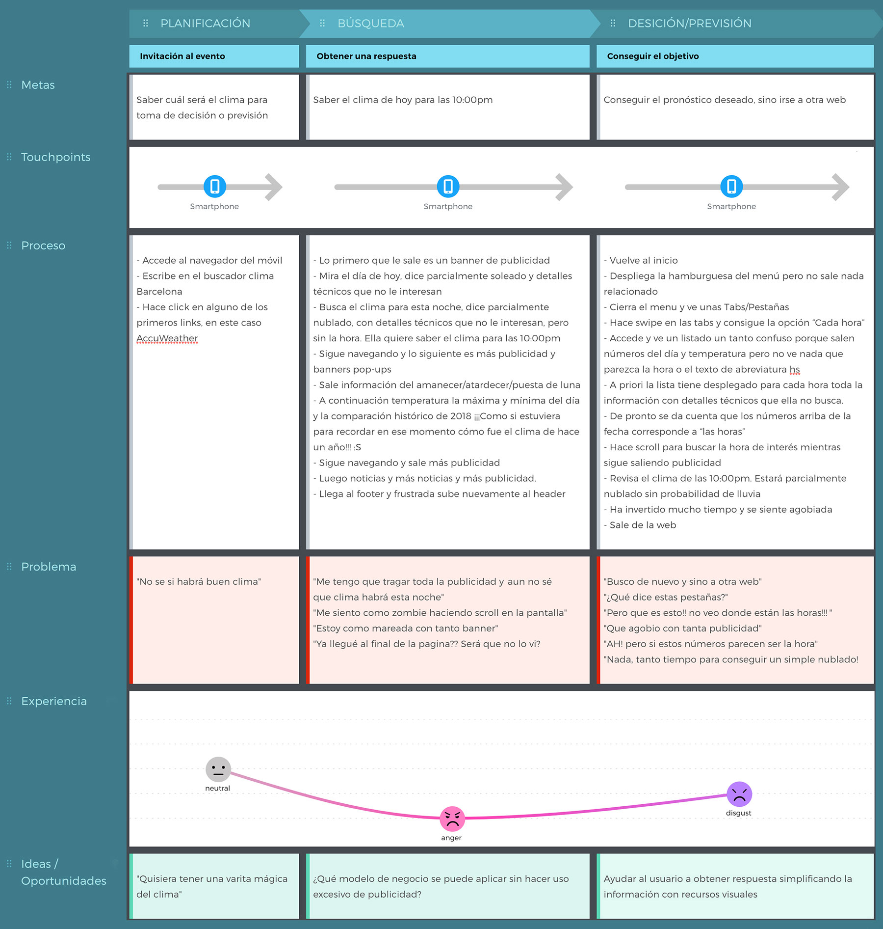
The opportunity
“To offer an easy product with quick access to basic information, instant visual of weather forecast reinforced by color and graphic elements, for example: animation of a cat as the main character, weather icon and background.”
UX Design
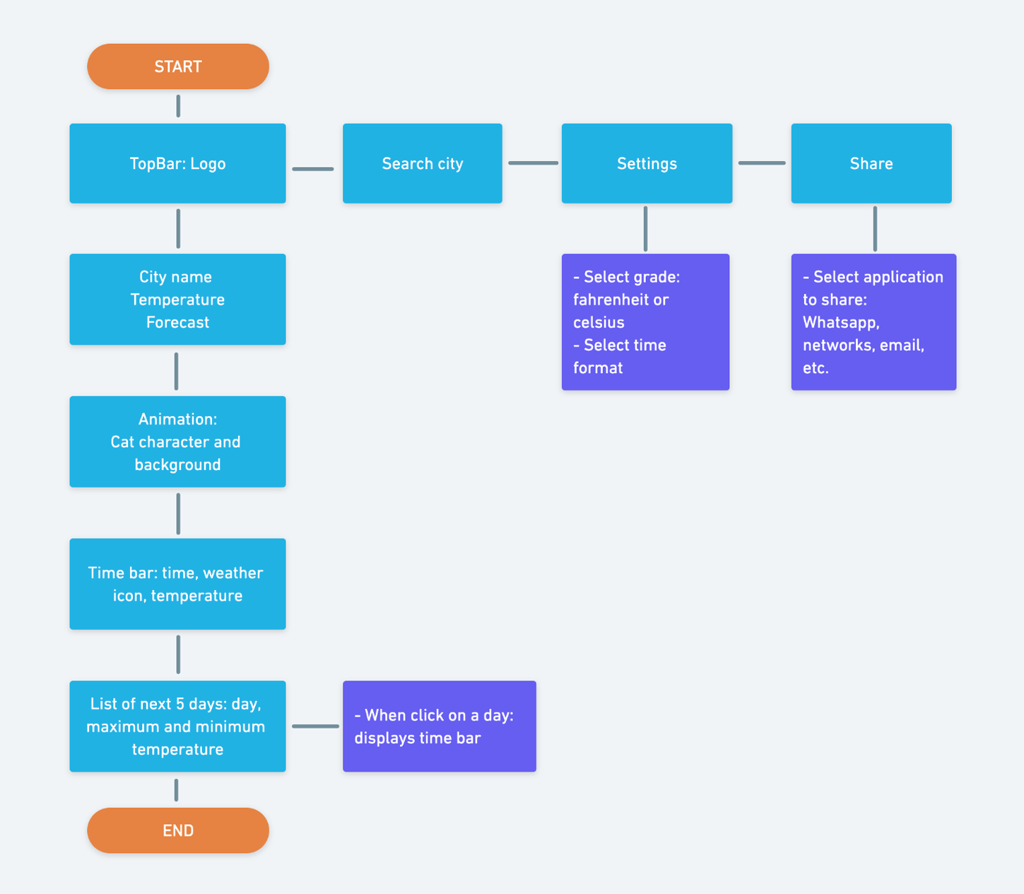
Information architecture
To organise the information I used a linear structure for both the mobile and web versions. The idea to match the app with the device ones is to make a single screen that contains all the elemental information:
- TopBar: logo, city search, settings (select temperature and time format) and share.
- City name, temperature and forecast.
- Animated cat with weather icon and background referring to time and weather.
- Time bar: with hour, icon and temperature that when swipe shows all hours of the day.
- List of next 5 days: with maximum and minimum temperature that when pressed displays the time bar of selected day.
Wireframe
As 88.2% of users connect on mobile device, I focused the design proposal on mobile first.
I designed the wireframe and performed the first usability test with potential users.
In these links you can see a demo and test by yourself the interactive wireframe.
Usability TEST #1
For the first usability test I set out following objectives to evaluate:
Business objective:
1 – Know if search icon is clear to the user.
2 – Know if it is clear for the user to access the desired day.
3 – Know if swipe mode on time bar is clear for the user to find desired hour.
4 – Know if sharing the application is clear to the user.
5 – Know user satisfaction level.
User Objective:
Know weather forecast for decision making.
To guide user test, I took the Customer Journey scenario and tasks assigned in order to continue evaluating same usability parameters but this time within “Gato Clima” application.
Scenario: You receive a friend’s message inviting you to an event tomorrow night in another city….
Task:
1 – Access Gato Clima application.
2 – Find weather forecast for the concert.
3 – Share the application with your friend.
Success: If user manages to change the city and see the forecast of scheduled day and hour as well as share the application.
Survey #2
To test usability #1 I sent a survey with the wireframe to targeted users to be respond within 24 hours.
The usability test shows following results regarding to the initial objectives:
1 – Know if search icon is clear to the user.
– 93.8% found easily to change the city of the event.
Within the analysis of comments leave by users I will make following adjustments:
– Add a current location icon.
– Add an element on search icon related to location.
2 – Know if it is clear for the user to access the desired day.
– 81.2% found easily access to desired day, Saturday.
– Taking into account user’s comments I will add the word TODAY – TOMORROW.
3- Know if swipe mode on time bar is clear for the user to find desired hour.
– 80% found easily the hour assigned. Taking into account user’s comments I will make an automatic jump to next day (after 00:00) if the user continues swiping through current time bar.
4 – Know if sharing the application is clear to the user.
– 93.8% found easily to share the application.
5 – Know user satisfaction level.
– The app’s score reached 4.3/5.
To highlight I obtained that user expected movement of the cat character and colourful background, which it is a good indicator that the animation proposed as a differential element will generate interest on users.
ui DESIGN
Simultaneously to described process I was creating GATOCLIMA brand and style guide. These are the points that I taked into account for its creation:
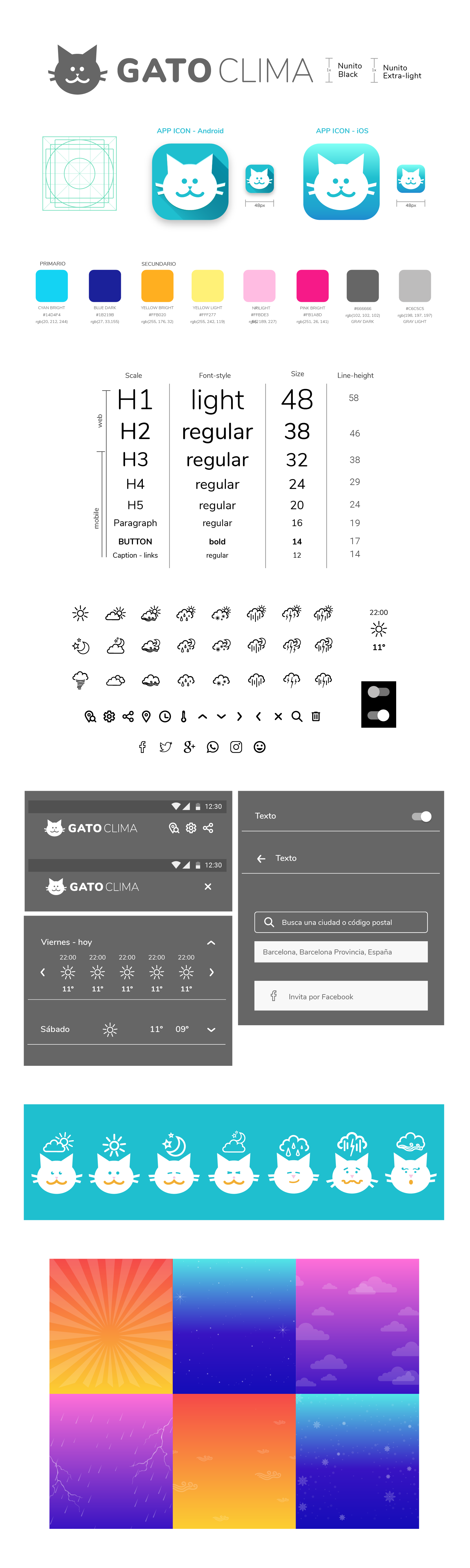
NAMING
GATOCLIMA
brand is a descriptive name, short, easy to read and pronounce, timeless and adaptable to other derived products. It is aimed to cat lovers market niche so its use for emotional reasons.
The brand personality is fun, cheerful and supported by an illustrated character – The Cat – that goes with the user through different weather conditions and it can be applied as an animated graphic resource.
LOGO
GATOCLIMA logo is made up of an isotype and a logotipo.
Both can be applied together or separately.
The icon app is represented by the isotype and colored background within corporate color range. For favicon the minimum isotype measure must be 32px wide.
COLOR
The color palette is based on a blue-magenta-yellow triad with RGB color mode and a minimum 4.5:1 color contrast ratio. The app colours chosen are: blue, orange, pink, yellow, white, black, gray and are based not only on the relationship with the weather but also on color psychology.
As background there are the moments of the day: dawn, day and night also with triad colours but on degrade style.
ICONOGRAPHY
The icons style is outline for both weather states and app system. The weather icons are also used with the animated cat character.
TYPOGRAPHY
The open font typography of google Nunito, is a sans-serif according to weather trend apps but with rounded style that gives smoothness and reduce rigidity to a sans-serif type. This typeface is ranking as 15 best google web fonts for 2019.
To make the typographic table I applied a 1,250 Major Third scale for Nunito web font family with a base size of 16px, a line-height of 120% and Light, Regular and Bold font style.
GRAPHIC ELEMENTS
As graphic elements I proposed backgrounds with the most relevant weather states that the user can can experience: sun, stars, clouds, rain, rays, snow, wind.
These backgrounds can be used alone or in combination with each other.
ANIMATION
The cat character is animated with weather icons and emotional gestures reacting to the current weather.
You can see animated proposal here.
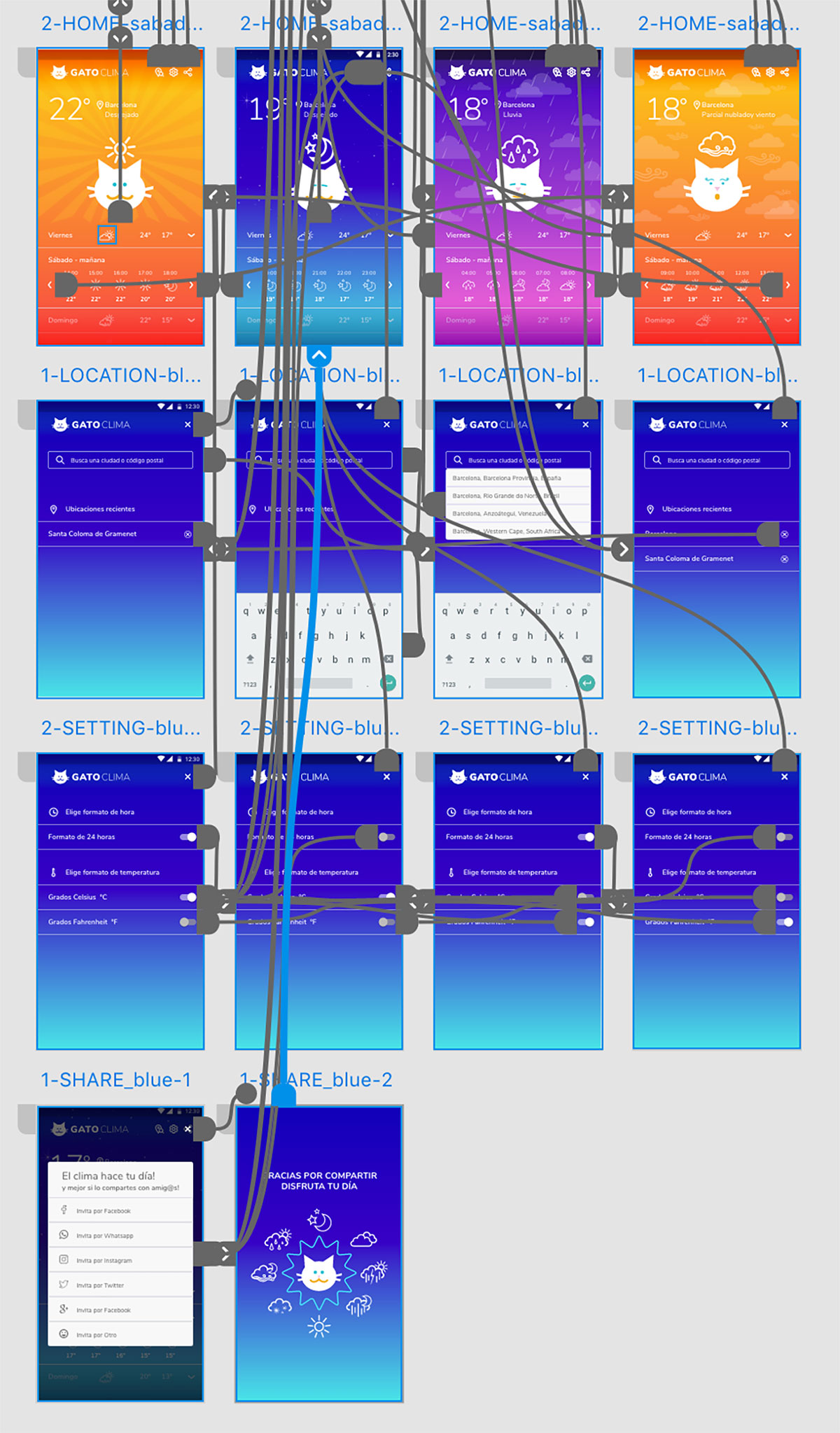
UI LIBRARY
For prototype design I created a library based on Atomic design methodology.
With the style guide: color, typography and icons, I added designed components and weather backgrounds according to the time of the day and weather conditions.
The library allowed me to create a Design System to make changes quickly and to facilitate development stage.
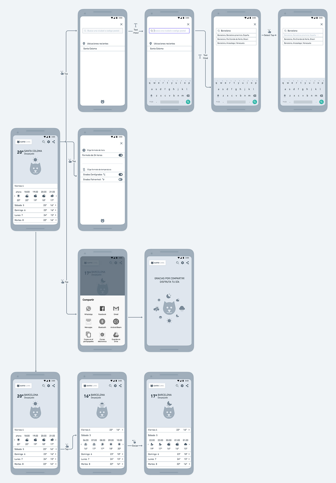
Prototype
When is time to bring the wireframe into life and with Adobe XD program, I used the UI library to design main screens and casuistics according to the weather condition and user interaction.
Then I performed the interactions between screens to simulate usability.
In these links you can see a demo and test by yourself the Prototype.
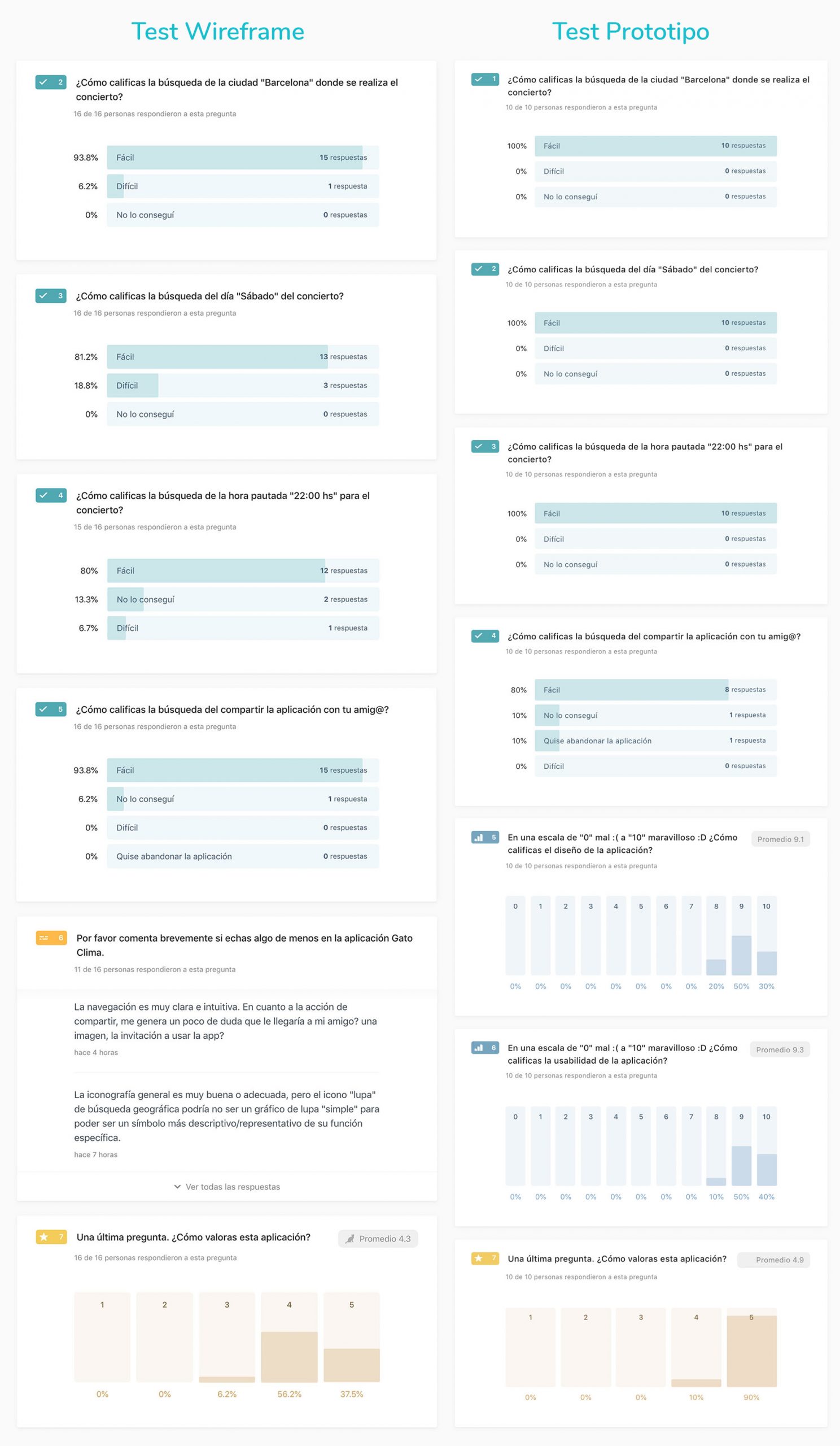
Usability TEST #2
To analyse GatoClima evolution I evaluated same parameters of usability test #1 as well as new aspects related to design and usability.
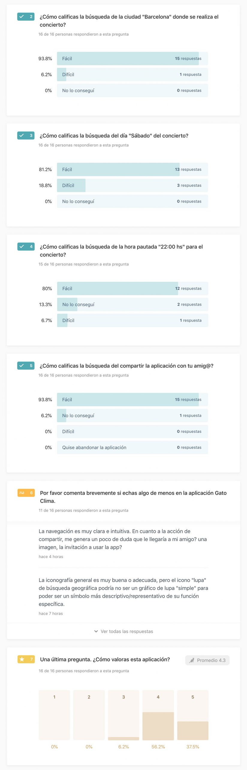
Survey #3
To test usability #2 I sent a survey with the prototype to targeted users to be respond within 24 hours in order to obtain a final validation.
The images show a comparison between wireframe and prototype test which highlights the following:
1 – 100% found easy to change the city of the event.
2 – 100% found easily access to desired day, Saturday.
3 – 100% found easily the hour assigned.
4 – 80% founde asily to share the application. This will be a point to look over, modify and evaluate again.
5 – The design gets 9 points out of 10.
6 – Usability gets 9 points out of 10.
7 – The app’s score reached 4.8/5.
IMPLEMENTATION
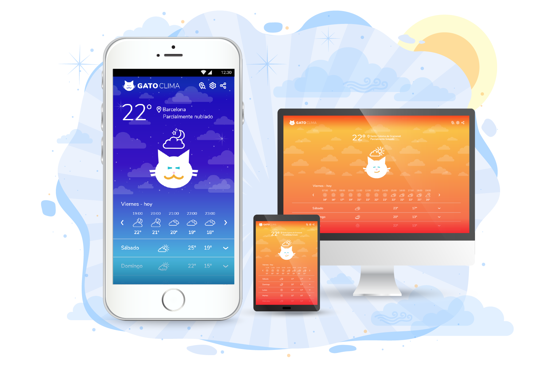
With final prototype version I went to development phase applying HTML and CSS language for a responsive web app. Since I had no programming language knowledge and with only 4 weeks ahead to learn code basics to develop a proposal, I set the goal of presenting a responsive basic prototype without JavaScript interactions.
To facilitate the process I adapted mobile prototype to tablet-desktop versions and divided the development process into several parts:
Export
As starting point I applied a methodology to export components and code. I followed these steps:
- I checked the components for mobile, tablet and desktop versions and corresponding names.
- I activated export mode to components of the UI library.
- With the Web Export plugin for XD I proceeded to export the screens. With this plugin I obtained a folder with all components at @1 and @2 resolutions, HTML and CSS files.
- With Zeplin plugin for XD I exported the entire prototype obtaining colours and typography styles and each screen with HTML and CSS indication of every component.
Refactoring
The material exported in Zeplin shows the components, their position within the layout, measurements, name, CSS and HTML, and .png or .svg format; You can also copy the code and download components in the required format and density.
The result with Web Export is displayed in a browser and with inspector option you can see the position of each component, measurements, name, CSS and HTML. You also can copy the code to use it on a code editor tool.
To start development I analyse the code obtained and rewrite it using the code editor Visual Studio code.
Code
With rewritten base code and looking to optimize timings, I defined objectives to web development process:
1 – Organize the page through structural elements in HTML: body, nav, main, footer.
2 – Define margins.
3 – Define adaptability/breakpoints.
4 – Writing content in HTML.
5 – Format the HTML through the CSS style sheet.
6 – Include web typography through Google fonts service.
7- Perform responsive tests.
Validate and Publish
To check code errors and to get final validation, I proceeded to review the files with W3.org online tool to validate CSS and HTML.
Once the code was validated I uploaded the files to a folder on my web server and published the website.
On this site you can view desktop, tablet and mobile version proposals.
Conclusions
The purpose of this project was to design a weather forecast web-app where I could test my knowledge of ideation, research, design, management, testing, validation and, as a new learn, write code.
When you work on multidisciplinary projects you have the support and collaboration of your team obtaining feedback during the process, sharing tasks and sharpening the eye to details within your deliveries or even the project overview.
In this occasion I played a leading role on each area. Of course I had the encouragement and feedback of my classmates! but each one was on the same situation being responsible and executor of their own project.
The experience was unique and unrepeatable in many aspects but I want to highlight the friendship and mutual support between the students. Each with their design styles, strengths and willingness to openly share their knowledge contributed to the improvement of our skills. I admire each everyone for launching a web-app project from start to finish.
As an anecdote, the hard part for most of us was to learn write code. Well, that was a challenge and an adventure that, at least me, I never imagined!!. Some people have some experience but in my case it was based on concepts, on solving something in wordpress and on working side by side with developers although I did not have much idea of the code on their screen and the magic that now I understand they do each day.
Magic!! Yes!! It is the word with I can define CSS code.
Anyway, facing the challenge of programming made me understand how a developer thinks and the need for my role as a UX-UI designer to deliver the most detailed, clear, organized and pixel perfect material.
I do not say goodbye without first thanking the creators of the book “Learn to program, Create your own website” by Coder Dojo, an ideal one for designers with🎨😺drawings and many colors. Without it I would not been able to understood the essence of HTML and CSS.
Thanks to my classmates! You all made my day! 😻😻